Chromatic adaptation and captivity

Jibril (2018)

Photographed by Carolina Steinbrecher

Graded by Edmond Laccon

Project details

Synopsis

Whilst doing time in prison Jibril falls for Maryam, a divorced mother-of-three. But after love and marriage behind bars prove to be ill-formed fantasies, what ties remain to bind husband and wife?

Filmmakers

Cinematography

Direction

Henrika Kull

Writing

Henrika Kull

Editing

Henrika Kull

Producing

Sophie Lakow

Post-supervisor

N/A

Technical specs

Acquisition medium

Digital

Cameras/Film scanner

Sony F55

Lenses

Arri Ultra Primes

Source material/Negative stock

S-Log3, 1920x1080

Apple ProRes4444

Aspect ratio

1.85:1

Grading system

DaVinci Resolve

Creative intent

Two faces over four seasons:
the captive and the mother 

One of the abbreviated working titles for the film was ‘Tornado’ and in a manner resembling that of Maryam, the film’s female protagonist, this was a project that seemed to sweep in and out at breathless speed – having recently been accepted into Berlinale’s Panorama category.

I hadn’t been involved in any pre-production discussions regarding the look of the film, yet the goals of cinematographer Carolina Steinbrecher and director Henrika Kull were clear and in harmony, which made making the most of the time we had easier.

Previous slide
Next slide

"Both captives of their life choices, they bounce between the light of their fantasies and the dark walls of reality."

Carolina Steinbrecher
Cinematographer

Linking seasons to skins

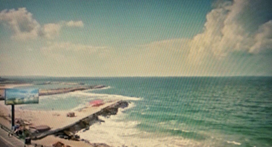
There were two main interpretive requirements for the grading. Firstly as the film’s narrative was punctuated by chapters based on the cycle of the seasons, it was important for Carolina and Henrika that the passage of time should be reflected in the visual appearance of each chapter e.g. ’Summer’.

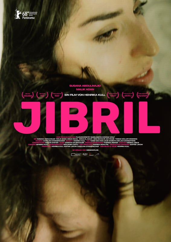
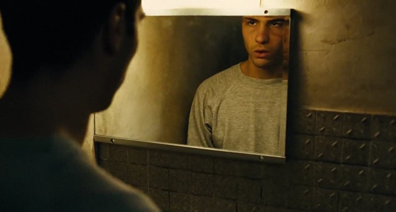
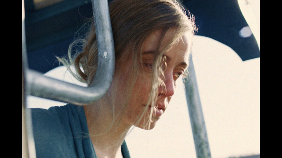
As JIBRIL largely takes place within the confines of a Berlin prison, the subsequent challenge was how to provide that reinforcement through grading in a subtle yet effective way, whilst at the same time keeping the grading operations as simple to manage as possible.

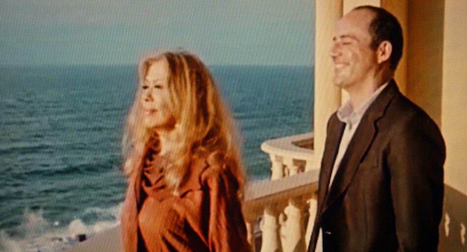
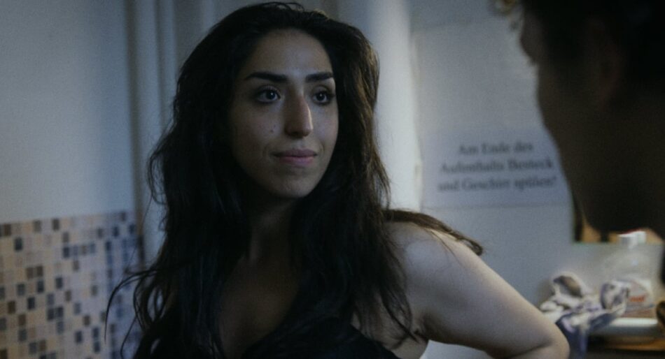
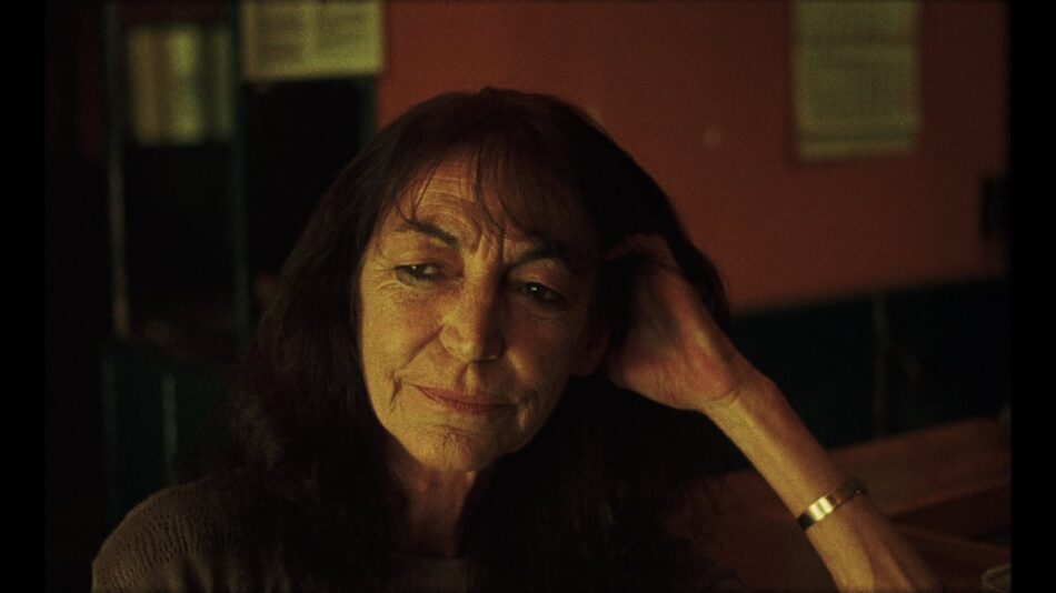
Another requirement that built on the same concern of reflecting the interplay of the time-passing on the reality of the characters – one living outside in freedom and the other as a captive, both DOP and director asked me to ensure that the appearance of the character’s complexions and skins also changed in respect to the evolution of the story and the passage of the seasons.

Would the solution be an ‘inside look’ and an ‘outside look’ both shifting over the course of the seasons? Given the time constraints, a more simple approach was definitely preferred.

Approaching grading

Complexions in captivity: GIRL, INTERRUPTED (1999)

When thinking about how to visually locate a character not just in an interior situation – but trapped in longterm captivity, the creative choices that lead to the rendering of faces, skin and lips in James Mangold’s GIRL, INTERRUPTED (1999) came to my mind as an effective solution.

Jack N. Green’s cinematographic choices, (complimented by make-up and production design) gave the female cast of mental hospital inmates unifying pale, pasty complexions. Even Angelina Jolie’s trademark lips, often accentuated in other films, are blended into her face.

Eggshell minds: through makeup, production design and the photography of Jack Green ASC, the inmates of GIRL, INTERRUPTED (1999) wear their loveless environment on their faces, showing that life in captivity has suppressed their individualities.

In this “eggshell” world [Jack Green ASC, American Cinematographer magazine, March 2000] the lack of colour and vitality in the women’s complexions and costumes, suggests their personalities have withdrawn from the external world as if subsumed by their environment, their appearance altering to reflect the world they inhabit.

Also whilst preparing I looked carefully at cinematographer Stéphane Fontaine’s rendering of prison life in UN PROPHETE (2009) but decided that its fantastically brutal contrast and harshly restricted colour palette would be an unsuitable reference for adjusting JIBRIL’s prison scenes.

Underworld or parallel world: rather than  heighten the contrast between a closed prison environment (see UN PROPHETE (2009), left) and the outside world, in JIBRIL we sought to portray both environments as half-home, half-prison – reinforcing the cruelness of Maryam and Jibril’s separation.

After discussing whether to accentuate the difference between being in freedom or captivity, Carolina and I would decide to reinforce the cinematography by further aligning Jibril’s prison world with Maryam’s domestic world, so both characters would appear in separate spaces that were half-prison, half-home.

The thinking was that if the characters shared the same daylight, same shadows and at the end – the same new year’s fireworks – we could heighten the pain of their enforced separation from each other.

Sharing the same light: tweaked through grading decisions (see below),  Jibril and Maryam seem to inhabit the same world – yet never experience life together.

Previous slide
Next slide

Final colour treatment

Four seasons, three white points

In designing a base look for the film, the question became how to underline their lives moving separately through the same seasons – regardless of whether we’re in the prison or outside it – without it being too obvious. The approach also had to be simple to manage.

I had always wanted to test the effect of grading under different white points within one film (i.e. ~5500K and ~7500K – to get a sense of their psychological and perceptual effects in both the cinema environment and the subsequent small screen adaptation. So I quickly came to the idea to use different white points for each season, switching between them beneath the chapter title cards (which always appeared over a black background). I wanted to know to what degree shifting white points would affect a viewer’s emotional reading of the story by gauging the influence of chromatic adaptation.

Previous slide
Next slide

Spring, summer, autumn, winter: JIBRIL makes simple use of custom white points to give a sense of the seasons passing – whether we are outside the prison or inside.

Rather than use one separate white point for each season I suggested we grade under a very warm white point for the summer chapter, a very cold white point for the winter part and use a more conventional white point for both spring and autumn as a transition.

I felt this approach would also go some way towards solving the question of how to align the appearance of the skin tones to the passage of the seasons – as a warm white point for summer should help accentuate the apparent warmth in the skin tones and a very cold white point for winter should diminish them.

There was not really time for experimentation yet Carolina and Henrika boldly agreed to run with the concept.

"The skin tones needed to go the journey - revealing them to be lonely, undernourished figures, desperately clinging to a source of emotional sustenance."

Previous slide
Next slide

A lighter shade of pale

As well as using different white points to influence the appearance of the skin tones relative to the seasons, I designed a base look for the film that lifted the luminance of skin colours more than I would typically ever do for for a project shot digitally.

The main cast had predominantly olive complexions so giving them much lighter, less healthy complexions helped create a sense of being always unsatisfied and under pressure – with both Maryam and her children as well as Jibril often traversing socially insecure environments.

Previous slide
Next slide

Absent father: Maryam’s domestic environment is rendered as an unstable, exhausted space – reflecting the draining pressures she faces as a single mother of three.

Even for scenes in which Maryam experienced intense joy or hope, I rarely allowed her complexion to become rich and healthy – the somewhat bloodless skin tones had to be part of the base look that defined the world of JIBRIL. The skin tones needed to go the journey – revealing them to be lonely, undernourished figures, desperately pursuing a source of emotional sustenance.

This approach would also serve as a good juxtaposition to the fantastically rich and over-idealised worlds portrayed in the north African soap operas that the Maryam greedily consumes.

Selling dreams: JIBRIL’s soap-watching scenes offer peepholes into golden, idealised lives – causing Maryam to question her situation and fuelling fantasies of a satisfying future with Jibril.

A heartbreak in winter

For the winter segment of the film that comes near the end and in which the character’s experience their most desperate yet intimate moments – the influence of the wintery white point combined with the lightened skin tones came together to created a suitably bleak and hopeless rendering of the couple’s final predicament – condemned to foster their intimacy in inhuman conditions.

This part of the film was particularly satisfying to grade as it was possible to let the ’look’ do all the heavy lifting, an outcome I had hoped for.

Previous slide
Next slide

Awaiting an icy dose of reality: viewed here a cold white point appears much more conspicuous than in the cinema – thanks to chromatic adaptation.

Outcomes

Approved by cinematographer Carolina Steinbrecher and director Henrika Kull, JIBRIL’s colour treatment solved a lot of the requirements for the grade, using a simple, consistent and easy to maintain approach.

The perceptual result of grading segments of the film with different white points turned out to have far less of an impact than I imagined in the theatrical environment, whereas the various white points naturally became more conspicuous on smaller, backlit displays (as you can see viewing this page). This is likely due to the amazing capacity the human visual system has to ‘dial out’ the influence of the illuminant on the scene, a power that is much more potent in the reference-less environment of the theatrical setting than a typical ~D65 laptop display.

Perhaps without the presence of the chapter titles i.e. ‘Summer’ with their black backgrounds, the transitions between white points would have been less subtle.

Final grade notes

Evaluating my colour work on JIBRIL, I think the summer and especially the winter segments work well but I would like to have had more time to have found a way to make the spring and autumn segments less of a safe, halfway interpretation between ‘summer’ and ‘winter’ and more expressive in the their own right.

Going forward

Pushing the illuminant

It would be interesting to revisit using contrasting white points within a single film, perhaps being bolder with the execution and exaggerating them to the point of being noticeable for the cinema version whilst reducing their differences for the TV version. Combining this with the possibilities of HDR might also yield expressive results.

As always such ideas await the right project to come along.

Credits

Text
Edmond Laccon

With thanks to
Carolina Steinbrecher & Henrika Kull
Jasper Granderath

IMDB Link

Featuring additional images from
GIRL, INTERRUPTED – Columbia Pictures

A PROPHET – Sony Pictures Classics

Behind the other looks

Distressing signals – GRAND JETÉ (2022)

To stand cold in the sun – I WANT TO RETURN RETURN RETURN (2020)