To stand cold in the sun

I Want to Return Return Return (2020)

Photographed by Giulia Schelhas

Graded by Edmond Laccon

Project details

Synopsis

Whilst awaiting a long-distance friend, a lonely young woman navigates a Berlin neighbourhood populated by talkative souls whose existences are often dominated by memories of their past lives.

Filmmakers

Cinematography

Giulia Schelhas

Direction

Elsa Rosengren

Writing

Elsa Rosengren

Editing

Esteban Alfaro, Elsa Rosengren

Producing

Margarita Amineva

Post-supervisor

N/A

Technical specs

Acquisition medium

Photochemical film

Cameras/Film scanner

Arri SR3, Arriscan

Lenses

Zeiss Standard Prime T2

Source resolution/Negative stock

Super 16mm as 2K DPX

Kodak Vision 3 (500T, 200T)

Aspect ratio

1.66:1

Grading system

Digital Vision Nucoda

Creative intent

A character adrift in a landscape of nostalgia

A journey into a microcosm of Berlin that resembles something of an existential snow globe, its glass glows golden in the seemingly endless summer sunlight. Drifting within this purgatorial sphere: a disparate tribe of characters, of personas whose often disrupted life journeys have all lead them, like a kind of social jetsam, to find a tenuous refuge in this one specific neighbourhood.

Our main character flits among them, considering their dislocated existences in relation her future – searching for her own sense of connection and belonging.

Previous slide
Next slide

"I wanted to create a feeling of longing, as if the characters are held suspended by summer, by the city and their lives."

Giulia Schelhas
Cinematographer

The sun as existential searchlight

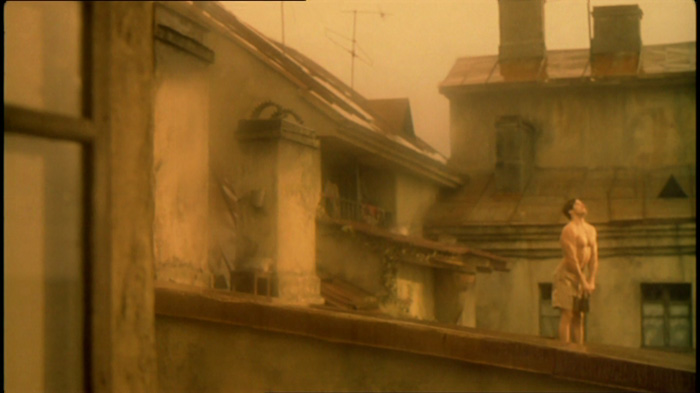
The blazing summer sun as a companion to the camera – illuminating these wayward souls among the social sanctuaries of the parks and streets or the cool gloom of bars, where they absorb themselves in justifying their past life decisions, sharing conclusions – exchanging morsels of self-validation.

Despite the radiant surface beauty, it should be a world that hints at feelings of melancholy, nostalgia and biting alienation. An expression at odds with its idealised appearance.

After the onset of dusk signals a horrifying return to isolation and loneliness – nightfall should bring everyone an opportunity to escape time and themselves. Then at dawn the cycle can begin again.

Visual references

A gold-green bubble:
LA DOUBLE VIE DE VERONIQUE (1991)

In discussing the look of the film cinematographer Giulia Schelhas asked for a colour treatment that would function along similar lines to cinematographer Sławomir Idziak’s rendering of the world of Krzysztof Kieślowski’s THE DOUBLE LIFE OF VERONIQUE (1991).

Previous slide
Next slide

For the most part Sławomir Idziak’s images encase its characters behind a wash of deep amber. The main protagonists of Weronika and Véronique appear removed from contemporary (politicised) reality, existing in their own naive worlds – yet they tell us they sense the existence of the other.

The lingering suggestion of another ‘foreign space’ existing beyond that of each heroine is conveyed through lighting (often background) elements green or at times red. Shooting interiors on tungsten stock also allowed the blue of exterior daylight to be transformed into green by the amber lens filtration – an economical solution. Only in the final image (of the U.S. version) are the two individual spaces finally reconciled.

Approaching grading

Related palettes

Amber filtration results in a dampening down of the blue channel and to a degree the green channel. The perceptual effects of this is that red and green scene elements appear to stand out whilst all blue elements lose their intensity (due to the reduction of the blue channel).

In AMELIE (2001), cinematographer Bruno Delbonnel often opts for an amber tint balanced more towards red with the intensity of red and green objects further exaggerated in post by colourist Didier le Foues.

A happier heroine: the grading of AMELIE (2001) further heightens yellow filtration’s tendency to intensify the appearance of red and green scene elements – often giving a cosy, graphical ‘two-tone’ appearance.

Previous slide
Next slide

Just as with VERONIQUE, amber filtration (on-set or in post) causes the blue scene elements of AMELIE to have their intensity reduced, contributing to the film’s generally romanticised appearance.

To counter this by then reducing dominant red and green elements yields a monochromatic, sepia result. An example of this can be seen in Aleksandr Burov’s cinematography for FATHER AND SON (2003). This did not seem a suitable direction to take.

Absent of colour contrasts: unlike AMELIE, the ‘burnished’ gold palette of Aleksandr Sokurov’s FATHER AND SON (2003) relies on a lack of colour variations and open shadows to create a different expression of an idealised world.

With its many park and bar settings, I WANT TO RETURN RETURN RETURN had a great deal of green elements in its images (grass, foliage, bottles) – so such an amber-only approach caused the world of the film to come across as too comforting and positive.

Final colour treatment

Towards a colder gold

In designing the final base look for the film, the key question was how to counter the romanticising effects of warm filtration. My proposed solution to Giulia and director Elsa Rosengren was to go with a gold world but one which leaned more towards yellow-green as opposed to yellow-red and in which the majority of green elements are shifted towards a cold, plasticising blue.

"The key question was how to counter the romanticising effects of warm filtration."

Despair at sunset: the texture and palette of William Blake’s THE BODY OF ABLE FOUND BY ADAM AND EVE (c. 1826) provided inspiration for the final visual feeling of the grade.

Sombre look: although graded into warm light – green elements such as foliage and bottles are shifted towards a cold, ominous blue.

Previous slide
Next slide

Image processing

Thanks to colour grading its feasible to alter the natural response of the illuminant – so that warm sunlight turns objects colder rather than warmer. The images below approximate the process.

1/3 Test source: S-Log2 8bit normalised to BT.1886
2/3 Green and red channels are compressed to emulate amber filtration, but blues lose intensity. The space evokes a romanticised, positive warmth.
3/3 The scene's blues are restored in intensity. Green elements are shifted to match the blues' perceptual value. Cold, deadened elements now counter the warmth.
Previous slide
Next slide

Into the blue: the blue cups lose intensity under yellow filtration (2) but can be restored and merged with green objects in grading (3).

Outcomes

Approved by cinematographer Giulia Schelhas and director Elsa Rosengren, this colour treatment was a bold choice and yet it worked with the context of the film. Although the effect is near impossible to produce without digital means – these blue ‘surviving’ elements in the images helped balance the golden amber appearance of the world of the film, without calling too much attention to themselves.

It was important not to go beyond what the power of an audience’s visual adaptation in the cinema could consider ‘feasible’ (see Final grade notes below).

Previous slide
Next slide

Final grade notes

The green-to-blue shift beneath the yellow filtration just needed to be dialled down for scenes in which green foliage appeared in bright direct sunlight – as it became obviously unnatural for large clearly natural green elements such as trees to appear cooler than expected in bright sunlight.

Going forward

Closer to VERONIQUE

I have not re-photographed locations from THE DOUBLE LIFE OF VERONIQUE as part of my RE:imaging series – but it would be interesting to work on retracing some of the colour solutions Sławomir Idziak created through his masterful combining of lighting, filtration and colour timing.

Approximating Idziak: a source image from another project I worked on, graded to fit into the palette of THE DOUBLE LIFE OF VERONIQUE. [image Andrea Tank-Nielsen/Josefine Lundberg]

Test render (source: C-Log1)

Credits

Text
Edmond Laccon

With thanks to
Giulia Schelhas & Elsa Rosengren

Featuring images from
Andrea Tank-Nielsen & Josefine Lundberg
FATHER AND SON – Wellspring Films

AMELIE – UGC Fox Distribution
THE DOUBLE LIFE OF VERONIQUE – Canal+ / Miramax

Which ‘look’ next?

JIBRIL (2018) – a film with 4 seasons and 3 white points.